


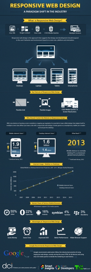
Besides mobile phones and computers, these days internet can also be accessed via e-readers, netbooks, tablets, televisions and gaming consoles. It is just not feasible to make websites for each and every one of them. Even now, according to a research, only around 9% of the total numbers of required mobile websites are up and running.
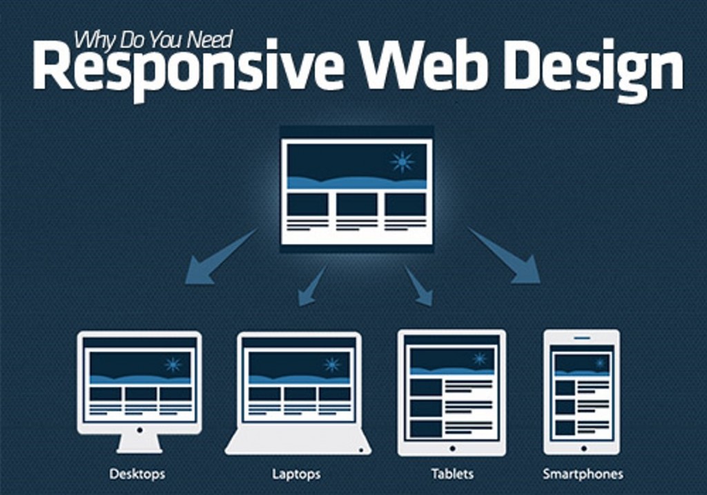
Won’t it be simpler to have just a single website that could work everywhere? Responsive web design technology does exactly this.
With the gaining popularity of smartphones, More and more websites are accessed via mobile devices. Websites that aren’t optimised for mobile browsing scare away visitors. Responsive web design can be a solution to this problem. If done correctly, responsive web design doesn’t only provide a better mobile browsing experience, but it can also improve the loading time by optimizing the content for smarthpones. Analysts at Morgan Stanley claim that the world is currently going through fifth technological revolution since the last 50 years. This one is based on the evolution of mobile internet. According to statistics, mobile Internet usage has been growing staggeringly over the past few years and is expected to overtake desktop Internet usage by the year 2013.
